Showing posts with label Character design. Show all posts

Wednesday, 9 September 2015

Tasty Rockin Rocky Road Ice Cream Cone


Hello Guys and Gal's.  Here is the Latest of illustration for the "Tasty Collection".  This is the Rockin Rocky Road Ice Cream Cone.  I wanted to choose something a little bit different from the normal ice cream you can think of lol so I chose the rocky road ice cream.  also I'm sorry this took so long.  I am very busy and these illustrations take up most of my free time, this also took a lot of time to finish because for a long time it was just a little bit off, but eventually it came out looking better than I ever could image.

anyway if you like the design and want it yourself then please follow the link below to my RedBubble or my Teepublic

http://www.redbubble.com/people/niallbyrne/works/16130967-tasty-rockin-rocky-road-ice-cream?grid_pos=2&p=t-shirt

https://www.teepublic.com/t-shirt/280147-tasty-rockin-rocky-road-ice-cream-cone

Breakdown
 1.

2.
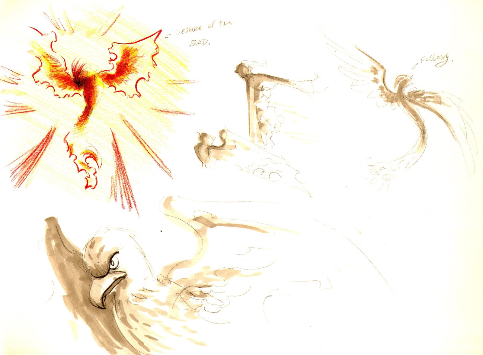
This is the original concept I did for the rocky road. It was originally going to be a grumpy little rocky road. A lot cuter and has waffle mowhawk.

3.
After doing the redesign I built up the shapes for the body and gave the ice a different ice cream cone shape to the strawberry one.  I was already working on the idea that the rocky road would the and literal rocker / punk rock.  the one this that kept changing was the face.   I was originally going to have a darker shade of the ice cream colour but you could barely see it, so I used the marshmellow instead.

3.

After that I made a pattern for the cone and had it clipped to the 2 cone shapes and the waffle mowhawk.  I took a while of testing the different thickness of the lines for the cone some being way to thick and others were way to thin.  I also added peanuts as it they are piercings and the random marsh mellows on the ice cream.


Finally I added more detail to the ice cream with more crispy bits and a bit of a swirl that I saw in reference images.  I also added the graphic background with kind of like a splatted ice cream and marsh mellows.  the dark pink is the darkest colour for the marsh mellow and the dark brown is for the ice cream.  and the !!!??!! supposed to be a lighter colour to the marsh mellow and also represent the ice cream screaming lol.  I'm really glad I added the graphic because it really makes everything else the image pop and stand out compared to the last one.  I will definitly be adding a graphic onto the strawberry Ice cream so the match but the strawberry will be more toned down compared to this one.

Anyway this is it for this post.  I really hope you like it and if you want let me know what you think.
also follow on tumblr and twitter cause I will randomly will post something up there that might not be here lol.

http://madmanwithagraphicstablet.tumblr.com/

https://twitter.com/Phoenix_tweetin

Thanks again, and see you in the next post. :)

Sunday, 9 August 2015

We Love Freddy


Hello Guys and Gals, sorry for the delay but I'm happy to show you my latest fan illustration for the characters in Five Nights at Freddy's.  I am a big fan of the games, and I absolutely love the designs.  This illustration is in tribute to the main bear himself Freddy Fazbear.  This one includes the design of Freddy from the fnaf 1 and 2.  I love the design of the withered Freddy from fnaf 2, he has such a strong design and a very haunting stare. So for the illustration I chose to emulate the original trailer for the game, were Freddy is singing into the microphone on stage in the spotlight.

if you like the design and want it for yourself follow the link below.


Break Down

This is the original sketch of the design, I really wanted to have the focus of the image be the spotlight and freddy stare.  I also had the idea to try have the shading look like a skull.


After scanning the image a redrew the sketch and roughed out the upper body and added shading.  I was really with the way it turned out and moved onto the other 2 characters and started building up the shapes.

After the rough was done I moved onto making the shapes and adding the shadows and the spotlight. once that was done I added the highlighted the shapes and extra shadows to the characters.


After the characters were done I added a brick texture to the background and added afew more small details to the characters and a few stars and a banner.  I really wanted to make it look like he is up on the stage ready to preform.

anyway I hope you all enjoyed this image  and if you want more check out the other fnaf fan designs I've done and follow me in the links bellow.  Thanks so much again for all the support.  check out next week for the next tasty collection ilustration will be up. and if you haven't already check out Five Nights at Freddy's 4!! its with out a doubt the scariest game in the series.

https://twitter.com/Phoenix_tweetin

http://madmanwithagraphicstablet.tumblr.com/

Thanks again, :D

Saturday, 18 July 2015

Tasty Strawberry Ice cream cone


This is the second of the Tasty Collection. A Tasty Strawberry Ice cream with Chocolate Sauce and a Cherry on top. She is the sweetest and the sleepiest.
or try it hear.

Rough

This is the original concept doodle.  Using the same technique from before I tried to keep it as simple as possible while giving it a little life to.


Shapes

after the rough I redesigned the shapes so they were more rounded off and appealing for the character.  I wanted to really make a cute and the roundness helped make the character more appealing.


Finally Shine and the shading.   I kept the colors very vibrant and appealing and also messed around with different shading effects for the gradient in the chocolate sauce, and shade on the strawberry.  If you want this is illustration for yourself you can find it here.

https://www.teepublic.com/t-shirt/241282-tasty-strawberry-icecream-cone

http://www.redbubble.com/people/niallbyrne/works/15610806-tasty-strawberry-ice-cream-cone

or follow me here on these links :) thanks again, for checking out my work. 

http://madmanwithagraphicstablet.tumblr.com/ https://twitter.com/Phoenix_tweetin


Saturday, 3 March 2012

Kitchen concept art

Heres one of the concept images i have done for the kitchen in my student film "Pheonix and the chef" the kitchen looks much better now in terms of everything on the walls, but the center of the kitchen is still the same. I might change it to look more like the final enviorment.  I'll be uploading a couple of more images at some point.

Sunday, 15 January 2012

"Phoenix Medium Rare" model sheets


Heres afew of the model sheets i've made for the Pheonix character, i'll be releasing the rotation sheet and the facial expression another time. And other illustrations to do with the film.  Enjoy

Saturday, 3 December 2011

"Phoenix Medium Rare" - More concept art


One of these 4 birds will be the final design for my short film that I'm working on with four other class mates.  I am in charge of all concept and art of the film, i will also be doing a bit of animation.             


These are concepts for the chefs design, i am still working on the chef and this probably won't be the final design for the character.  the problem with the character is that he is not really style wise similar to the Pheonix, since the pheonix is the main character, the film will lean towards her needs, yes her.  But anyway these are old designs for the character.

Thursday, 29 September 2011