Wednesday 29 October 2014

Dragon Master


Hey guys and gals,  This this is my illustration for the Animation Art show 2014.  The animation art show is an annual exhibition and auction that takes place in Dublin in aid of Irish children's charities.  I donated the first ever print to the Animation Art show first So that it could make as much money for charity as possible, and thank you to everyone who bid on it.  Here is a link down below.

http://www.animationartshow.com/

The piece I gave is an original Digital Painting of  "How to Train Your Dragon 2"  I love this Film and I believe its one of the best animated films this year.  Everything in this movie moved me so this is more or less a tribute to the movie.
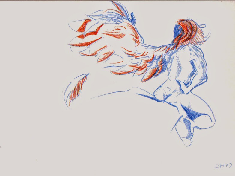
Break Down


I Started of with this original Sketch of just Hiccup, but I felt this wasn't strong enough by itself.


So I added Toothless and swapped Hiccup around and altered his clothes to be on the right side.


I then did the outline and started coloring.  but I took special attention  to the flat coloring of the characters so the flat color stands on its own as a piece.

Once all the flat tone was done I went in to each of the characters and painted in the different areas of  leather, clothe, scales and hair to make it look like the texture of the characters in the movie right down to the blush and freckles on his face. I also added to a contrasting light and and color to ad some atomshpere.


Hiccup has multiple different painter textures for his costume and face.
Toothless took the longest as I was experimenting with many different brushes to recreate his scales
Here are a couple of Zooms the Characters.

Anyway I hope you enjoyed this breakdown.

if you want a print of the High Resolution of the Illustration follow the link below.

http://www.redbubble.com/people/niallbyrne/works/12900596-dragon-master

if you wanna see more follow my socials

http://madmanwithagraphicstablet.tumblr.com/

https://twitter.com/Phoenix_tweetin

http://aaniallbyrne.blogspot.ie/

Friday 19 September 2014

Mega Slowbro Redesigned

 Hey guys and gals sorry for the lack of update but I've been working on some secret projects.  But anyway this is something that I need to address the moment it was leaked.   Pokemon started releasing a new Mega-evolution for pokemon already introduced in to the game.  There ment to be have a slightly different design and better stats for the competitive game.  All of the new designs so far have been more or less intimidating by comparison to there previous forms.  Until mega Slowbro came out.  His design looks silly and he looks like an ice cream cone standing like a spinning top.  So I redesigned him to be more suited to the other mega pokemon.  I designed him so that it looks like the shell tried to swallow from behind and then slowbro punch out is arms and legs, and now slowbro has a fully armoured torso and it looks like the slowbro and shelder are one pokemon as a whole instead of two seperate pokemon. Sorry if this sounds like a rant but I love all the other new mega designs but slowbro deserves a better mega form.
 This is the flat line and color no shading.
And this is the rough sketch.  If you like my redesign please share it around please.

Friday 30 May 2014

Daniel Bryan Progression


Hey guy here is a quick gif of WWE superstar Daniel Bryan.  I'm testing out the best setting for gif's and I want to make other animations I have into gifs to people can watch them straight away, instead of uploading them to vimeo.  Also the focus is Daniel Bryans hair growth since starting in wwe in 2010 to now I think its funny how radically his hair and beard has grown since he started.  

Want to follow me or have any questions/comissions then contact me hear.

http://madmanwithagraphicstablet.tumblr.com/

https://twitter.com/

aaniallbyrne@gmail.com

Wednesday 28 May 2014

MegaMawile vs MegaCharizard


This is a animation test I did in flash and comped in after effects.  It is more of a test to see what I can get out of working in flash and learn the program better.  I want to make a collection of these animations for a while so that there is more animation on my blog.  I'll be picking out all the mega pokemon and giving them a battle animation of some kind, the newer ones will be more cinematic than this one which is kinda flat.

the reason why I started with these two is because they are the ones I use in the game the most, well I all ways use mawile, I love her mega form and its the strongest pokemon in the game.


This is the second pass rough of the animation and the rough is frame by frame of the animation. I then did the final line for the characters using the symbols and everything the get it done quicker.  Almost everthing was broken up into different layer because of charizard alone.  He breaths fire and has an constant fire on the tip of his tail, but mega Charizard slow has fire coming out of his mouth to, all of which needed to be animated.

This is what the characters looked like after they were all finished in flash.


After the animation is done a comp it in after effects.  I dont have a break down because there was just to much to back track.


But eventually after all the the extra shading and glow effect are done it looks like this.  The background was done in photoshop and comment if you can see the easter egg lol.

Hope you all enjoyed this.  
I will be makeing this into a collection of animation tests with all the megapokemon.  If you like it share it around and comment with possible ideas for another one :).  Also if you want any custom images or comissions send me and email.

https://vimeo.com/niallbyrne

https://twitter.com/Phoenix_tweetin

http://madmanwithagraphicstablet.tumblr.com/


Sunday 4 May 2014

Dr Sketchy's Mystique


 Messing around with an old style of using Polychromos I love to do.


 This one was a themed, Mystique in the middle of transforming to something, I chose a bird.


These are the best 1 minute and 2 minute sketches I like thrown together.(not very well lol)

Hey Guys and Gals these are more Dr Sketchy Sketches, This was an amazing Mystique themed event where the model was body painted to look like Mystique.  Honestly I wish I had more time to paint to model because it looked so cool with more lighting I could have done something amazing.

 follow me here :D

https://twitter.com/Phoenix_tweetin

http://madmanwithagraphicstablet.tumblr.com/

Dr Sketchy Pin-Up Sketch's


Here is are some sketches I did in Dr Sketchy's in the a small gallery, honest I cant remember the name, if anyone know which one it was let me know please lol,  I decided to try to stylize them like the old pin up stuff, I might photoshop one of them.  

more on the way.

Thursday 1 May 2014

Shipwreck Island Concept


Hey guys here is a new post, this is a concept piece, did a couple of weeks for a game.  The basis is that this is part of a set of islands that are part of a bigger map.  This is a concept for what maybe one of the islands might look like.  It has Isometric perspective and I used a slightly different process than I usually do.

I started with a rough sketch on the image and I brought it into flash. (my illustrator wont work on my computer...)  I broke up the image to many different shapes and exported them as PNG files and the colored and painted them in Photoshop.

The Lighting was broken up with dark shad on the left and sun on the right, I also had the rocks under the water which were very difficult to paint.  I was really trying to create the illusion the the rocks under the water and the blend between the sand and the waves on top.  If I had more time  I probably would have made the sun light more contrasting and added more to the pirate ship on top on the rock, and a little more texture to.

 Let me know what you think and thanks for checking it out.

Thursday 17 April 2014

Attack on Evangelion 100th Post


Hey Guys and Gals,

Since this is my 100th post here is an Art trade I did with my friend Dave De Keyser.  He's is an amazing animator and illustrator.  If you wanna check out his art work follow the links below.

Dave De Keyser

http://oneminutestudios.blogspot.ie/

https://www.facebook.com/theartofdave


So the Art trade is we both choose a subject to draw and Dave gave me a few of his favorite anime shows to draw from and I saw Attack on Titan and Evangelion, I kinda had a spark in my head and this was the result, It took a long time to finish because I've been really busy.  So I took the time and an hour a day doing this.

Break Down

I started with a really rough gesture of the characters and the buildings.


Once I was happy with the rough, I started putting the characters on model and start the the line work.  Since these characters are so Iconic so I used reference from there shows to keep them on model.


Once all the like work is done I start filling in all the flat color for the characters and the background.
I used the colors directly form there model sheets or screen shots to keep them true to the show.


Once the flat tone is done I start adding in gradients for the characters and the building so they are light the same as the sky.  I add shading and two main color highlights, one from the sun and red to be the over all light.  I also added airbrush dust clouds around the characters and rubble to both show the impact they had on the building but also the sheer size of the Titan and Eva.  I also painted in textures into the ground and buildings to ad even more detail.


Hope you all enjoy, I'll have more stuff for you soon.  Also Please Follow me blog, twitter and tumblr if you want more.

https://twitter.com/Phoenix_tweetin

http://madmanwithagraphicstablet.tumblr.com

or if you want a print of it go hear :D

http://www.redbubble.com/people/niallbyrne/works/11842248-attack-on-evangelion?p=art-print

Tuesday 1 April 2014

Female Warrior Concept art

Female warrior


 Environment

Hey guys, I have been recently applying for working everywhere.  Alot of the work I do I'm not allowed to show off... but this time they let me on the condition that I dont mention the studio..... so Yay here you go, a medieval , warrior game.  I had to create a full rotation of the character and a progressive environment with upgrades so I made a base of a old house that a tree had over grown and upgrading the building you start to build around the tree and into the tree.  The full stage is where the Tree has rotten to you build a tower inside the center of the tree and a bit of a church looking building beside the tree.

Ill have more stuff soon :)

http://madmanwithagraphicstablet.tumblr.com/

also follow my tumblr please

Tuesday 25 March 2014

Silk Road Film Festival 2014


Love is Blind was shown in the Silk Road Film Festival on the 23 of march 2014.  lots of people showed up and the film got lots of laughs.  So I illustrated this image of Medusa and Ti in the photos of the festivals.  Unfortunately I didn't have a camera for the Film Fleadh so I though I'd start with this festival with my little sisters camera,  I kinda wanted to do something Like this for a while now.  I used photo show to impose Medusa and Ti into the photo, giving them more fleshed out Lighting and shadows to Make it look Like there in the Shot and added a little film grain and a tint.  It was very difficult to do this because to the flash of the camera but hopefully you like it, I'm definitely gonna try to do more soon so stay tuned.

Friday 14 February 2014

Happy Valentine's Day 2014 prt 3


Here is the last one for valentines day.  If you single keep your hopes up because there is someone out there for everyone.  You just need to know where to look.

Here is the line.

This is the original rough, kinda wish I had something better for the background but I couldn't think of anything lol.  Have a great Valentines Day.

Thursday 13 February 2014

Valentines day 2014 prt 2


Hey guys and gals here is the second installment of Valentine's day illustrations.  This one is more of a nicer version.  It is of a nice morning with a bit of a moral, I dunno.  Just don't get wrapped up in all the material stuff. Find all the hearts and I'll give you a cookie.

I used Photoshop CS6, Half the time I use the generic Brushes, the first line of brushes when you open up the list.  I use a Wacom Tablet and I have just a little higher on the sensitivity because I found either I am digging to heavy on the stroke before or the opposite, but putting the sensitivity helps a lot with the line work, I was using pinks the represent love and the orange to represent happiness. I feel orange and pink really work well together to create a calm loving enviroment. 


Here is the is the line version.  I colored the lines darker as it gets closer to the foreground to create a little depth.


Here is the original rough.

There will hopefully be one more so keep tuned in :D

Come here if you wanna buy a print of the card.

http://www.redbubble.com/people/niallbyrne/works/11529292-cuddles-valentines-day-2014?card_size=4x6&p=greeting-card&ref=shop_grid

Wednesday 12 February 2014

Valentines Day 2014


Hey guys here is the first of a couple of Valentine's day pics I doing right now, there all based on little phrases or funny pic up lines. This one is "You're as hot as the tea you threw in my face."  It was part of a podcast i listened to a year ago and it stuck with me.  the podcast was called "Wha-Chow Podcast", easy to find so go look it up. The characters are also based on my original Valentine's day illustration i did a couple of years ago.  Think of it as a continuation of the first illustration.


This its the line and roughing over the background.

This is the original sketch I did with a pen.

There will be one or two more to come hopefully before Valentine's Day so see you soon.  

If you wanna buy the card go to the link below.

http://www.redbubble.com/people/niallbyrne/works/11529164-hot-as-tea-valentines-day-2014

Monday 20 January 2014

Under my Bed event


Hey Guys, just wanted to show some pics from the Under My Bed charity event.  Thank you to Amy Dawson and Karen Lee for display the illustrations.  the Show were sold out 2 of the  night and almost full on the first.  The illustrations were well received and were raffled off to 5 lucky people got a copy of each illustration. 


I also did a line drawing for a kids competition, best colored in gets a prize, these are a couple I saw color in after the show.

 
It may not luck like it but I was absolutely over the moon.  I have been working nonstop for a few weeks now so  look like a zombie lol.  Also thank you everyone who come out or showed some support to the show, it really means a lot to me.  will have some new stuff up soon.

Tuesday 14 January 2014

Mega Mawile rough animation


Here is a rough piece of animation I have been doing with flash.  I'll be starting the fine line when I have all the fire animation for Charizard done.  The animation is of a Mega Mawile vs a Mega Charizard X from the new Pokemon game that came out in October.  I love the games and love Mega Mawile so I wanted to do a little test.  I was thinking of making this a series of animations of either pokemon I like or of the other mega pokemon it the new game.  It will be a while before the fine line is up, I'm still deciding wether to use flash or tvpaint.  we'll see what happens.

Monday 6 January 2014

Phoenix Medium Rare Film 2012


Hey guys, Me and mate are putting this online now. Its been 2 years of entering festivals and now its finally online.  This was the first film I made in college with my classmate.  I would not have been able to put it do it without them :).

It was entered in

Student Media Awards April 2013

Fingal Film Festival Award/ April 2013

 Galway Film Fleadh July 2012

and won the

Royal Television Society Award as an Undergraduate 13/02/2013 for Short Animation Film 

I haven't posted anything about the success of the Phoenix film on my blog so I want to do it now.  Please check out the film either here or on Gavin Hoffmans channel the more views the better thank you so much for taking the time :)

Thursday 2 January 2014

"Under My Bed" Smock Alley Theatre 16th to 18th January 2014

"Under My Bed"


Hey guys, I have been very busy in the last few months working on a few different projects.  One of them is a childrens Charity event Called "Under My Bed".  Under My Bed is a patchwork of childhood stories from some of Ireland's  Most recognisable - chefs, broadcasters, politicians, writers, actors and musicians.  All the proceeds of the show will go to "Barnolds Ireland."

I have been working on a few illustrations based on one of the stories that will be read at the show.  Child hood stories will be read at the event and its all for Charity so, If you have the time come on down to the Smock Alley Theatre on the 16th to the 18th of January.

Also The images plus about 4 or 5 others of mine will be there to on display and the will be up for auction if you wanna framed one ;D

Heres a Link to the websites of the event and where to get tickets and lots more social Media.

Under My Bed Website

http://www.undermybed.ie/

Facbook

https://www.facebook.com/undermybed2014

Twitter

https://twitter.com/UnderMyBed2014

Tickets

http://smockalley.com/under-my-bed/

also share this as my as possible if you can.  Thanks again for taking your time to look at this.