Wednesday, 8 July 2015

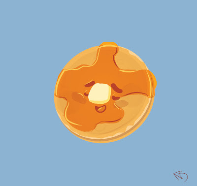
Tasty Pancake


Hello Guys and Gals its been a while.  I have been working a lot recently on a lot of different animation projects to the point where I have very little free time, but I have been working on a collection of art work.  I don't have a name for the collection quite yet so I will call it the "Tasty" collection.  these images will be all themed on sweet and tasty foods with cute faces.  I wanted to try making an original collection of illustrations and this is the first of many.

The first one is tasty pancake.  Its a Tasty pancake relaxing covered in Syrup and loving it. Why because I love pan cakes and really wanted to make a character out of it.

Breakdown

1

This is the original Rough of the image and was with all the other doodles.  I have been Experimenting with colour and mostly flat shape.  it was more of trying to bring out the character it the image and I was thinking of the syrup being almost like oil and thought of a pancake tanning in the sun with the syrup.  The muppets with also a huge inspiration for there use of simple shape and color.

2


Basic flat shapes

I continued to build up the flat shapes in photoshop and keeping it more rounded off as possible.
the simple shapes were really important, to keep the nice vibe and character in the illustration.


final

after that I mess around with the clipping tool the different shapes to add the gradient shading and the reflective light and shade of the syrup.

Thank you so much for looking at the first of many Tasty's.  If you like the illustration and want it for yourself follow the links bellow.

https://www.teepublic.com/t-shirt/227012-tasty-pancake

http://www.redbubble.com/people/niallbyrne/works/15356893-tasty-pancake

also follow me here

https://twitter.com/Phoenix_tweetin

http://madmanwithagraphicstablet.tumblr.com/

Thanks so much for checking it out and stay tuned next week for the next Tasty illustration. :)


Monday, 13 April 2015

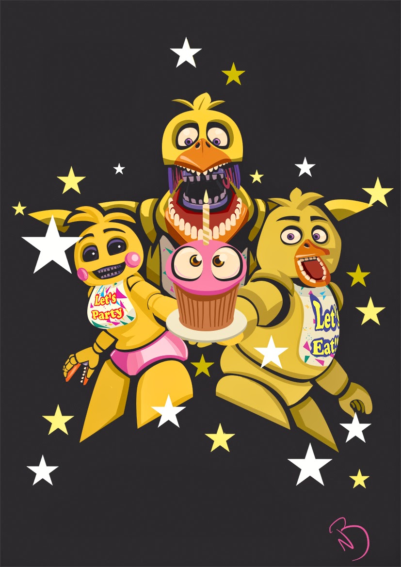
We Love Chica


Hey guys and gals belated happy Easter,  This is another illustration of the Five Nights at Freddy's characters.  This time it is all the different designs of Chica the Chicken.  I really like the designs from each game and how each one is drastically different to the last.  If you Like the image and want if for yourself check out the links :)


Breakdown

I started with the rough version using reference images from the game.  I had a number of different designs done but this one was much better than the others.


I broke up the characters completely into shapes and worked on trying to get the proportions correct.
the biggest problem I had was the middle versions inside mouth, since it was a front on shot.


Once that was done I added the shading and highlights to that characters.
Here is also a close up of the illustration.


Thanks for checking out the post, also follow me on tumblr and twitter for more,


Wednesday, 4 March 2015

We Love Foxy and Mangle


Hey Guys and Gals here is another Five Nights at Freddy's illustration.  This time I chose the 2 characters who have caused me the most unexpected deaths and jumps out of all the characters.
I used the designs from the second game for foxy because I find him a lot more intimidating.


if you like the design follow the link below. 

http://www.redbubble.com/people/niallbyrne/works/14207553-we-love-foxy-and-mangle?p=t-shirt

Process

In the begining I started straight into photoshop once I had an idea in my head for the composition.  I used the default brush and worked lightly working out the shape and deisgn so the match the characters in the game.


after the rough version is done I had everything I wanted I started making the shapes of the hears and the black whole as if the 2 characters are behind the curtains of Pirates Cove.  using the pen tool.


The characters faces are very detailed and complex so I constantly was altering the heads to get them as close as possible to characters.  Once the I finished all the parts I added smaller details like shading and highlights.  also the layers began to become huge and I turned a lot of the layers into smart objects.  The smart objects act kinda like a symbol does in flash.  I can open up the object in another file and edit the layers inside the smart object but in the out site image there is only one layer.


 And this is the end of the illustration.  Thanks again for  looking at the blog if you like it share it around and check out my other work there will be more comming soon.

http://madmanwithagraphicstablet.tumblr.com/

https://twitter.com/Phoenix_tweetin

http://www.redbubble.com/people/niallbyrne/works/14124707-we-love-bonnie

(also check out the new Five Nights at Freddys's 3 game released on steam.)


Saturday, 28 February 2015

We Love Bonnie


Hey guys and gals.  Here is a fan illustration of all the versions of Bonnie from Five Nights at Freddy's 1 and 2.  I love these games, the scary, fun and for me really competitive.  Bonnie is my favourite character, I also find him the most intimidating to.  I did this illustration so I could have some t-shirt designs for myself lol.  I also had it up on Qwertee to see if people would like it but it didn't really work out.  Qwertee is very hard to get voted into.

unfortunately I cant show the breakdown of the image as the file is to big to open.  the original resolution saw super high to.  But I have a zoom in of the toy bonnie.


I was using illustrator to see if I could make it nice a crisp.  I also did a little shading with photoshop.
Anyway thanks for looking, If you like it share it around and give feedback.

ALSO if you would Like the design for yourself go to my redbubble account with the link below.


also follow me on tumble and twitter.


there will be a foxy and mangle one coming out soon enough to so stay tuned.

all the characters are owned by Scott Cawthon and this is my fan illustration to his amazing and original concept.  Check his website and if you haven't already try out the games for yourself, (the third games is coming out soon.)

http://www.scottgames.com/

Wednesday, 29 October 2014

Dragon Master


Hey guys and gals,  This this is my illustration for the Animation Art show 2014.  The animation art show is an annual exhibition and auction that takes place in Dublin in aid of Irish children's charities.  I donated the first ever print to the Animation Art show first So that it could make as much money for charity as possible, and thank you to everyone who bid on it.  Here is a link down below.

http://www.animationartshow.com/

The piece I gave is an original Digital Painting of  "How to Train Your Dragon 2"  I love this Film and I believe its one of the best animated films this year.  Everything in this movie moved me so this is more or less a tribute to the movie.

Break Down


I Started of with this original Sketch of just Hiccup, but I felt this wasn't strong enough by itself.


So I added Toothless and swapped Hiccup around and altered his clothes to be on the right side.


I then did the outline and started coloring.  but I took special attention  to the flat coloring of the characters so the flat color stands on its own as a piece.

Once all the flat tone was done I went in to each of the characters and painted in the different areas of  leather, clothe, scales and hair to make it look like the texture of the characters in the movie right down to the blush and freckles on his face. I also added to a contrasting light and and color to ad some atomshpere.


Hiccup has multiple different painter textures for his costume and face.
Toothless took the longest as I was experimenting with many different brushes to recreate his scales
Here are a couple of Zooms the Characters.

Anyway I hope you enjoyed this breakdown.

if you want a print of the High Resolution of the Illustration follow the link below.

http://www.redbubble.com/people/niallbyrne/works/12900596-dragon-master

if you wanna see more follow my socials

http://madmanwithagraphicstablet.tumblr.com/

https://twitter.com/Phoenix_tweetin

http://aaniallbyrne.blogspot.ie/