Tuesday, 22 December 2015

Rick and the Time Lords!


The original Rick and the Time Lords


T-Shirt version Rick and the Time Lords
This is a Cross over image I had done for Eirtakon 2015.  It is a crossover between The Doctor from “DR Who”, Rick from “Rick and Morty” and Doc Brown from “Back to the Future”.  They all crash there respective Vehicles and start to Jam! forming the Greatest Band in Time and Space!
This was the most popular thing I had at the con by far, I loved everyones reaction to the idea :D it was an amazing con! and cant wait till next year!!
if you Like these illustration and want them for yourself follow the links bellow :D
Quality Teeshirts!!
Teeshirts and lots of other Merch!!!

Break Down
1. Rough

I started the original Rough and paper and cleaned it up again in photoshop.

 2. Line and Flat Tone


After the Rough I worked for a very long time doing the line art and the flat tone of the colour, I have it very broken up to this is the best way to look at the line art.  I spent most of the time working on each of the characters vehicles  *cough the Car* its was hard to find good reference from the film with the angle I chose.

3. shading and effects


After working on the tones I moved on and added a tint the characters, shading and a few highlights from the mad destruction in the background.  I enjoyed this part just for experimenting with the colours for the fire and the glow of the doctors Sonic Screwdriver.  I think it really mad the image pop.


Here is a little close up of the background behind the characters.  I added a lot of unnecessary detail in the back and it gets blocked to I thought I'd show a close up :).

any if you got through that and have any other questions just msg me and ask me on twitter :)

also if you wanna follow me other  places  I'm here to :)


Thanks so much for check out my blog :) see you in the next post.

In Her Universe


Hey guys and gal’s.  This is the one of the illustrations I had at Eirtakon 2015.  I love Steven Universe.  I love all the characters but my absolute favourite is Greg Universe, I love his young design and his entire back story.  So I had to do one for him first.  The illustration is of Greg reaching for a the pick star.  The universe space background and everything in pink are to represents Rose. and Greg is just a comet in her universe.  reaching for the stars and his dreams. I will at some stage be doing more for my other favourite characters soon. also thank you so much for check out my stuff :) If you want to see more follow the links :) 


and if you want this illustration for yourself? well follow the links here?


now the breakdown :)

1. Rough

I started with a quick rough using the default brushes in photoshop.

2. Line

After I then worked on the line work of Greg himself .  (Fun Fact : I did the line art on the train lol) I have been doing this for a while luckily not a lot of people are giving me a weird look :D

3.  Flat Color

Once the line is done start doing the color, I find the best way to do the flat color of a character in photoshop is the make a layer underneath your line layer.  The under layer will be the base.  Once that's done you can either make the Shape of the characters silhouette with a brush or you can make a selection around the characters line. (if your going to make a selection make sure to  go select_modify and either expand or contract the selection by 2, this will make the selection go underneath the line) then use the bucket tool to make shape.  once you have a default shape you can make extra layers on above the shape you made and you can now right click and use the "Create Clipping Mask" and now the new layer will only show stroke inside the shape you made early,  the process helps keep your strokes inside the line.

4. Shading and background

Once all the flat colour is done. I work on the shading and tinting and the space background.  I made a few custom brushes to make the space effect, its mostly small things like the variation's of colors and the cloudy gradients and stuff.  The main reason for the space background is that it represents Rose, and greg is just a comet in her universe.


This last image is the alternative t-shirt version of the image and Roses silhouette is literally in the image now dispersing into pink petals.

Thanks again so much for checking out my art work :)


Tuesday, 24 November 2015

The Crash of us "update"


Hey Guys and Gal's, today I bring you "The Crash Of Us" version 2.  This is the one of the three illustrations I debuted at Eirtakon this year, it was an absolutely fantastic weekend and I got a lot of positive feedback.  Anyway here is the break down.

if you like it and want it for yourself follow the links bellow.

quality teeshirts


Merch and other stuff


Breakdown.
1.


This was the Original version I did when the last us us game first came out.  I was really trying to make the two point perspective in this one.  I also loved that Ellie would crouch under Joel when Joel is hiding behind a box.


So I worked on a a few angles to see what works best and I really liked the sketch of Coco on the bottom left.


I took that sketch and roughed out the entire Idea and added shading and foreground shadows.


After that I worked on the like and took my time and worked on getting all the reference to look right.
I also added colour and adjusted Crash to be more serious like Joel and the black foreground shape to look like a widened Crystal.  there are so clickers and a lot of different references to the first 2 crash games while still referencing the last of us.


After that I added lots of shading and multiple Light sources.  I am really happy with the way it came out! I will also have another possible crash of us illustration after this. :) hopefully I get more time to finish it.

Thanks so much for checking out my blog if you want more follow my tumblr and twitter.


thanks again :)

Thursday, 12 November 2015

Eirtakon promo 2015


Hey Guys and Gal's, as you can see from this post I will be part of Artist Alley this year so I made a quick promo poster show off the prints.  Eirtakon will be starting tomorrow so check out the website and see all the other events and talented artist in the artist alley!  I will be selling my fnaf art and 3 new illustrations that will Debut at the con!!

I have also Updated the blogger design, the same will be happening to my tumblr and my twitter when I get a chance, just so they are all uniform :)  hope you like the New look.

thanks so much again, for all the support and hopefully I'll see you at the con :) 

Wednesday, 9 September 2015

Tasty Rockin Rocky Road Ice Cream Cone


Hello Guys and Gal's.  Here is the Latest of illustration for the "Tasty Collection".  This is the Rockin Rocky Road Ice Cream Cone.  I wanted to choose something a little bit different from the normal ice cream you can think of lol so I chose the rocky road ice cream.  also I'm sorry this took so long.  I am very busy and these illustrations take up most of my free time, this also took a lot of time to finish because for a long time it was just a little bit off, but eventually it came out looking better than I ever could image.

anyway if you like the design and want it yourself then please follow the link below to my RedBubble or my Teepublic

http://www.redbubble.com/people/niallbyrne/works/16130967-tasty-rockin-rocky-road-ice-cream?grid_pos=2&p=t-shirt

https://www.teepublic.com/t-shirt/280147-tasty-rockin-rocky-road-ice-cream-cone

Breakdown
 1.

2.
This is the original concept I did for the rocky road. It was originally going to be a grumpy little rocky road. A lot cuter and has waffle mowhawk.

3.
After doing the redesign I built up the shapes for the body and gave the ice a different ice cream cone shape to the strawberry one.  I was already working on the idea that the rocky road would the and literal rocker / punk rock.  the one this that kept changing was the face.   I was originally going to have a darker shade of the ice cream colour but you could barely see it, so I used the marshmellow instead.

3.

After that I made a pattern for the cone and had it clipped to the 2 cone shapes and the waffle mowhawk.  I took a while of testing the different thickness of the lines for the cone some being way to thick and others were way to thin.  I also added peanuts as it they are piercings and the random marsh mellows on the ice cream.


Finally I added more detail to the ice cream with more crispy bits and a bit of a swirl that I saw in reference images.  I also added the graphic background with kind of like a splatted ice cream and marsh mellows.  the dark pink is the darkest colour for the marsh mellow and the dark brown is for the ice cream.  and the !!!??!! supposed to be a lighter colour to the marsh mellow and also represent the ice cream screaming lol.  I'm really glad I added the graphic because it really makes everything else the image pop and stand out compared to the last one.  I will definitly be adding a graphic onto the strawberry Ice cream so the match but the strawberry will be more toned down compared to this one.

Anyway this is it for this post.  I really hope you like it and if you want let me know what you think.
also follow on tumblr and twitter cause I will randomly will post something up there that might not be here lol.

http://madmanwithagraphicstablet.tumblr.com/

https://twitter.com/Phoenix_tweetin

Thanks again, and see you in the next post. :)

Sunday, 9 August 2015

We Love Freddy


Hello Guys and Gals, sorry for the delay but I'm happy to show you my latest fan illustration for the characters in Five Nights at Freddy's.  I am a big fan of the games, and I absolutely love the designs.  This illustration is in tribute to the main bear himself Freddy Fazbear.  This one includes the design of Freddy from the fnaf 1 and 2.  I love the design of the withered Freddy from fnaf 2, he has such a strong design and a very haunting stare. So for the illustration I chose to emulate the original trailer for the game, were Freddy is singing into the microphone on stage in the spotlight.

if you like the design and want it for yourself follow the link below.


Break Down

This is the original sketch of the design, I really wanted to have the focus of the image be the spotlight and freddy stare.  I also had the idea to try have the shading look like a skull.


After scanning the image a redrew the sketch and roughed out the upper body and added shading.  I was really with the way it turned out and moved onto the other 2 characters and started building up the shapes.

After the rough was done I moved onto making the shapes and adding the shadows and the spotlight. once that was done I added the highlighted the shapes and extra shadows to the characters.


After the characters were done I added a brick texture to the background and added afew more small details to the characters and a few stars and a banner.  I really wanted to make it look like he is up on the stage ready to preform.

anyway I hope you all enjoyed this image  and if you want more check out the other fnaf fan designs I've done and follow me in the links bellow.  Thanks so much again for all the support.  check out next week for the next tasty collection ilustration will be up. and if you haven't already check out Five Nights at Freddy's 4!! its with out a doubt the scariest game in the series.

https://twitter.com/Phoenix_tweetin

http://madmanwithagraphicstablet.tumblr.com/

Thanks again, :D

Saturday, 18 July 2015

Tasty Strawberry Ice cream cone


This is the second of the Tasty Collection. A Tasty Strawberry Ice cream with Chocolate Sauce and a Cherry on top. She is the sweetest and the sleepiest.
or try it hear.

Rough

This is the original concept doodle.  Using the same technique from before I tried to keep it as simple as possible while giving it a little life to.


Shapes

after the rough I redesigned the shapes so they were more rounded off and appealing for the character.  I wanted to really make a cute and the roundness helped make the character more appealing.


Finally Shine and the shading.   I kept the colors very vibrant and appealing and also messed around with different shading effects for the gradient in the chocolate sauce, and shade on the strawberry.  If you want this is illustration for yourself you can find it here.

https://www.teepublic.com/t-shirt/241282-tasty-strawberry-icecream-cone

http://www.redbubble.com/people/niallbyrne/works/15610806-tasty-strawberry-ice-cream-cone

or follow me here on these links :) thanks again, for checking out my work. 

http://madmanwithagraphicstablet.tumblr.com/ https://twitter.com/Phoenix_tweetin


Wednesday, 8 July 2015

Tasty Pancake


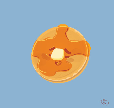
Hello Guys and Gals its been a while.  I have been working a lot recently on a lot of different animation projects to the point where I have very little free time, but I have been working on a collection of art work.  I don't have a name for the collection quite yet so I will call it the "Tasty" collection.  these images will be all themed on sweet and tasty foods with cute faces.  I wanted to try making an original collection of illustrations and this is the first of many.

The first one is tasty pancake.  Its a Tasty pancake relaxing covered in Syrup and loving it. Why because I love pan cakes and really wanted to make a character out of it.
Breakdown

1

This is the original Rough of the image and was with all the other doodles.  I have been Experimenting with colour and mostly flat shape.  it was more of trying to bring out the character it the image and I was thinking of the syrup being almost like oil and thought of a pancake tanning in the sun with the syrup.  The muppets with also a huge inspiration for there use of simple shape and color.

2


Basic flat shapes

I continued to build up the flat shapes in photoshop and keeping it more rounded off as possible.
the simple shapes were really important, to keep the nice vibe and character in the illustration.


final

after that I mess around with the clipping tool the different shapes to add the gradient shading and the reflective light and shade of the syrup.

Thank you so much for looking at the first of many Tasty's.  If you like the illustration and want it for yourself follow the links bellow.

https://www.teepublic.com/t-shirt/227012-tasty-pancake

http://www.redbubble.com/people/niallbyrne/works/15356893-tasty-pancake

also follow me here

https://twitter.com/Phoenix_tweetin

http://madmanwithagraphicstablet.tumblr.com/

Thanks so much for checking it out and stay tuned next week for the next Tasty illustration. :)


Monday, 13 April 2015

We Love Chica


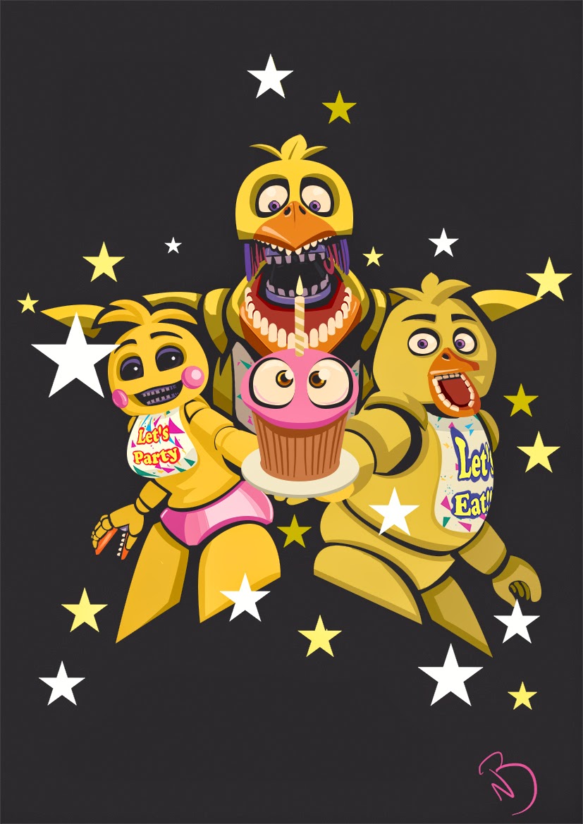
Hey guys and gals belated happy Easter,  This is another illustration of the Five Nights at Freddy's characters.  This time it is all the different designs of Chica the Chicken.  I really like the designs from each game and how each one is drastically different to the last.  If you Like the image and want if for yourself check out the links :)


Breakdown

I started with the rough version using reference images from the game.  I had a number of different designs done but this one was much better than the others.


I broke up the characters completely into shapes and worked on trying to get the proportions correct.
the biggest problem I had was the middle versions inside mouth, since it was a front on shot.


Once that was done I added the shading and highlights to that characters.
Here is also a close up of the illustration.


Thanks for checking out the post, also follow me on tumblr and twitter for more,


Wednesday, 4 March 2015

We Love Foxy and Mangle


Hey Guys and Gals here is another Five Nights at Freddy's illustration.  This time I chose the 2 characters who have caused me the most unexpected deaths and jumps out of all the characters.
I used the designs from the second game for foxy because I find him a lot more intimidating.


if you like the design follow the link below. 

http://www.redbubble.com/people/niallbyrne/works/14207553-we-love-foxy-and-mangle?p=t-shirt

Process

In the begining I started straight into photoshop once I had an idea in my head for the composition.  I used the default brush and worked lightly working out the shape and deisgn so the match the characters in the game.


after the rough version is done I had everything I wanted I started making the shapes of the hears and the black whole as if the 2 characters are behind the curtains of Pirates Cove.  using the pen tool.


The characters faces are very detailed and complex so I constantly was altering the heads to get them as close as possible to characters.  Once the I finished all the parts I added smaller details like shading and highlights.  also the layers began to become huge and I turned a lot of the layers into smart objects.  The smart objects act kinda like a symbol does in flash.  I can open up the object in another file and edit the layers inside the smart object but in the out site image there is only one layer.


 And this is the end of the illustration.  Thanks again for  looking at the blog if you like it share it around and check out my other work there will be more comming soon.

http://madmanwithagraphicstablet.tumblr.com/

https://twitter.com/Phoenix_tweetin

http://www.redbubble.com/people/niallbyrne/works/14124707-we-love-bonnie

(also check out the new Five Nights at Freddys's 3 game released on steam.)


Saturday, 28 February 2015

We Love Bonnie


Hey guys and gals.  Here is a fan illustration of all the versions of Bonnie from Five Nights at Freddy's 1 and 2.  I love these games, the scary, fun and for me really competitive.  Bonnie is my favourite character, I also find him the most intimidating to.  I did this illustration so I could have some t-shirt designs for myself lol.  I also had it up on Qwertee to see if people would like it but it didn't really work out.  Qwertee is very hard to get voted into.

unfortunately I cant show the breakdown of the image as the file is to big to open.  the original resolution saw super high to.  But I have a zoom in of the toy bonnie.


I was using illustrator to see if I could make it nice a crisp.  I also did a little shading with photoshop.
Anyway thanks for looking, If you like it share it around and give feedback.

ALSO if you would Like the design for yourself go to my redbubble account with the link below.


also follow me on tumble and twitter.


there will be a foxy and mangle one coming out soon enough to so stay tuned.

all the characters are owned by Scott Cawthon and this is my fan illustration to his amazing and original concept.  Check his website and if you haven't already try out the games for yourself, (the third games is coming out soon.)

http://www.scottgames.com/